
Watch application
The design process of the watch application has multiple stages. The first requirements were established after the first couple of online meetings with our co-designer. After the first co-design session, the first ideations were made and presented at the mid-term presentation. With the feedback of the presentation, 5 concepts were made and these were tried during co-design session 2. With the feedback from the co-design session, the final design was made.
Requirements
The watch is a physical product with an application that can be used with a display screen. The application must meet certain conditions (requirements):
-
The application should be as simple as possible
The user should not get overwhelmed when using the application. Therefore the application only needs to have the most basic functionality. Also, the interactions that the user can do need to be clear right away.
-
The application of the watch should communicate with the phone app and website.
The user should be able to look back at their answers in the phone app or website. Also, the user should be able to put their planning on the agenda in the phone app or website. The interval of the notification is based on the planning of the user.
-
The watch should vibrate when getting a notification
A notification only needs to be felt or seen by the user and should not draw attention from the surrounding. The users should feel the vibration good but not get overstimulated.
-
The application should give a notification at a certain interval.
The user should get the question ‘How are you feeling?’ every now and then. The user should be able to adjust the interval themself with the planner on the website or phone app by using colors. The user should be able to answer the question by interacting with the watch application.
-
The watch should have a snooze button and an emergency button with interactions
The buttons on the watch could be physical or on the application. The user can snooze a notification with the snooze button and with the emergency button the user can get immediately get a notification.
-
The user should get feedback from the watch
The user can say how they are feeling. The watch should give feedback or tips back to the user.
-
The watch should give the time.
When the user is not interacting with the watch the watch should give the time. This eliminates the need for the user to wear two watches at the same time.
These requirements were set at the beginning of the design process. During co-design sessions, some more requirements were added to this list.
Ideation
During the first co-design session, it was thought together with the co-designer about how the basic functions should look like. This was done by using paper and markers and making a paper mock-up.
After this, the first ideation mock-ups were made in Figma. Especially during the ideation there was looked at the notification screen. There were 5 different notification screens made.

The placement of the buttons or slider required the most ideation because this is the part which the user needs to interact with. The interaction needs to be optimized and the user should be able to answer the question quickly, easily, and accurately. Also, a snooze button was added under the page. Later on, in the concept phase, more iterations were made for the snooze button. The emergency button or interaction was not yet added. Afterward there beel looked at the style and color.
The green, yellow and red buttons were connected to a screen to give the user feedback. This can be visualized in the picture to the left.
During the ideation, only the connection between the notification buttons and feedback screens was explored. Later on, different concepts of the feedback screens were made.

Concepts
After testing the ideations ourselves and after the mid-term presentation 5 different concepts of the application were worked out. These mock-ups were tested by the co-designer during co-design session 2. With this feedback the final design is created. The mock-ups can be seen and be interacted with by this link:
https://www.figma.com/proto/TjdUR0a5EY4rtWi7fy1iCF/mock-up-app?node-id=75%3A146&scaling=scale-down&page-id=17%3A6&starting-point-node-id=75%3A146&show-proto-sidebar=1
Mock-up 1
The concept is most similar to the ideation mock-ups. The emergency button was also added. By clicking ‘NU’ you will go to the notification screen. The co-designer liked the 3 colored buttons but not the colored feedback screens because it was to visible for the surrounding. The notification screen was also to visible to the surrounding because it popped up immediately. Next to that the style was not matching with her own style because it was to basic and not elegant. More about her style and our research about that is mentioned in the watch product part.

Mock-up 2
The concept has more interaction possibilities. The functions stayed the same as mock-up 1 but the user could give feedback with a slider. This slider could go from 0 till 100 and would gave the user more different feedback options. The snooze button is in this mock-up not a button but you have to slide the screen up to snooze the notification. The green, yellow and red colours are also used in this concept but are more minimalized. The emergency button in this concept has the question ‘Hoe gaat het?’. This concept was to complicated to use.
Mock-up 3 & 4
Mock up 3 and 4; the third and fourth concept were both more simplified and only grey tones were used instead of the green, yellow and red colors. Both concepts have different slide options. In concept 3 you get the notification by swiping up and in concept 4 you get the notification by swiping left. The emergency button is the also with the swiping up or left. The simple interactions and the swiping of the notification certainly appealed to the user. Only the the grey tones and style in general didn’t fit.
Visualization of mock-up 3

Visualization of mock-up 4

Mock-up 5
This concept has almost the same interactions as concept 3 but has a different style and feedback information was added. The style was matched the phone app mock-ups. The colors of concept 1 are also used in the notification screen again. The co-designer liked the style of this concept better and the interactions were sufficient too. For the final design of the watch, application improvements have been made to concept 5. After the co-design results, a couple more conditions were set up to finalize the design of the application.

-
The notification needs to be swiped
The user liked the idea of swiping first the notification up and afterward giving an answer. In this way, the notification is more hidden from the surrounding.
-
The buttons need to have green, yellow and red colors
The co-designer found the green, yellow and red colors more clear than the grey tones that were used in concepts 3 and 4.
-
The snooze button should only be physical
The physical snooze button at the side of the watch was preferred. By removing the snooze button from the application there is also more space for the color buttons and is it easier to press the buttons on the screen.
-
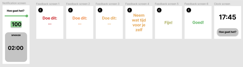
The feedback screens should have neutral colors
The feedback screens with neutral colors draw less attention from the environment and blend more in.
-
The feedback screen should give more tips
The user can put in tips in the phone app themself. These tips get the user when he/she is overstimulated. The feedback screens should show all the tips in a certain category. Because if every time a tip is random given this causes inconsistency. Showing all the tips at the same time is not possible because the screen is too small. The user should be able to swipe through the tips.
-
The screen should go back to the clock screen after a certain time not interacting with the application
After clicking the green button the ‘Goed!’ screen has to be shown for a couple of seconds and go back to the clock screen. When the user clicks the yellow or red button it should take longer before the screen goes back to the clock screen.